Web design is like fashion: to stay relevant, you need to constantly be aware of current trends. We’ve rounded up the best web design trends for 2022, from experimenting with 3D elements and animations to using old aesthetics in a new way. Be sure to read this article if you are planning your web design.
#1. 3D illustrations
Remember the crazy 3D GIFs from the early 2000s? Last year they returned to web design but in a much more sophisticated form. Now they are slowly moving from maximalism to new minimalism to give sharpness and originality to balanced designs.
With most of the real examples and web design concepts from the creators of Dribbble and Behance, we can distinguish three main areas of 3D illustration.
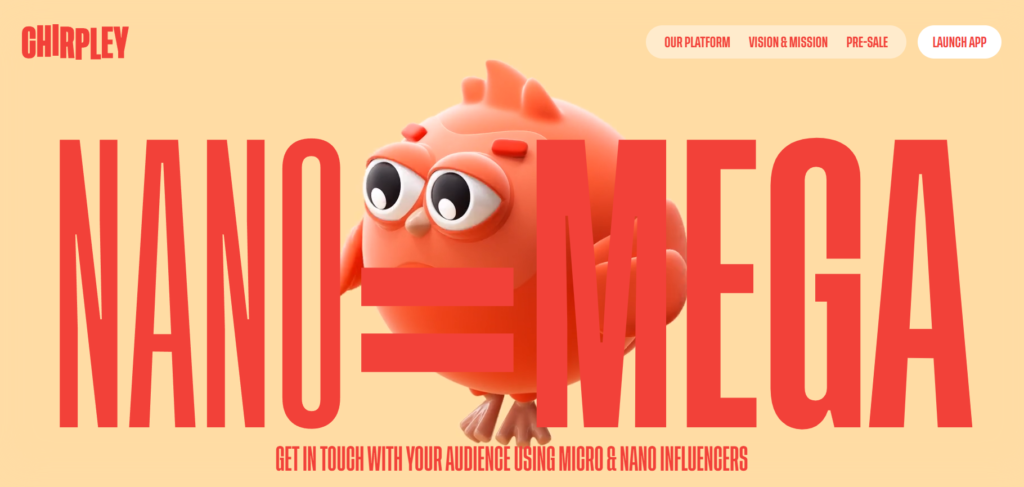
3D cartoon characters are the first trend. They resemble traditional corporate-style images, but their three-dimensionality makes them far more fascinating, friendly, and lifelike. These characters, especially when animated, have the appearance of plasticine characters.
The second sub-trend is 3D cutouts, which look like a collage of 2D cutouts in a 3D space. When paired with the parallax effect, which allows the viewer to enjoy a 3D experience by hovering over a complicated group of illustrations, this style is really catchy.
The last one is real humans transformed into 3D cartoon versions, which you’ve definitely seen a lot of lately.
#2. 2D cartoons
When we were doing our investigation, we found three different approaches to this trend on websites.
The first is using simple animations of 2D cartoon characters or products to improve the overall appeal of a simple website. This might be a loading screen, a hero part, or a series of little animations to go along with each section. The second trend is about using the entire interface to look comical to make a website stand out. Specific cartoon characters aren’t required in this scenario because every button, menu, and element appears to be cartoonish.
#3. Computer-generated imagery
The building of strong interactive websites that assure customer engagement is the next big thing. CGI graphics, in fact, perform best in animated web design, which shows the quality and friendliness towards cutting-edge technology of firms that can afford it. Furthermore, the higher the visual quality, the higher the brand’s quality, and the greater the sense of professionalism, dependability, and trustworthiness.
Animated visuals of a high level of complexity are not required. In reality, small animations and semi-abstract pictures might greatly enhance your design.
#4. ’80s vibe
The 1980s are recognized as a period in pop culture, music, and technology that left an enduring impression. Madonna, MTV, Back to the Future, Pac-Man, the Nintendo GameBoy, big blazers, shoulder pads, and permed hair – all these we got thanks to the ’80s.
Today, web design pays homage to that time with retro wave inspiration: bold fonts, bright and neon colors, geometry, as well as futuristic and cyberpunk themes.
Consider how a retro look might work best for your project if you’re thinking about creating an 80s-inspired website. Perhaps an entertaining 2D pixel game would help you communicate your thoughts and mission. Alternatively, perhaps carefully planned gradients, neon, and glitch effects can help you to create enigmatic yet seductive designs that instantly win the viewer’s attention and draw them into your universe.
#5. Parallax
Parallax scrolling was first talked about in 2011, and it immediately became widespread and popular among web designers. Web design trends have come and gone, changed and evolved, but parallax has always been a sought-after effect.
With the advent and widespread use of HTML and CSS, it has become much easier to create more interesting and memorable elements for the design of Internet pages, including landing pages.
When building a website, parallax is a great way to add depth and dynamics to a site. However, it must be used with caution. No more overzealousness, no unnecessary design weighting. The new parallax is more subtle and follows the old rule: less is more.
#6. Video background
Why is the video getting so much attention? In a word, it’s evolution. This is the main thing it all comes down to.
The video grabs our attention. Whether it’s high quality or not, it will get a lot more attention than a static drawing. Even if you’re standing in the Louvre looking at the Mona Lisa, you’ll still turn your head when a teenager next to you plays a YouTube video on your phone.
Through the years of evolution, movement meant danger. If a person did not notice that something was moving – for example, a tiger is sneaking up – there could be disastrous consequences. That is why the human eye and brain are fixed on everything that moves. And whether it is in real life or on the screen – it does not matter.
So cut multiple videos using an online video maker, merge them into one, and loop. With the right approach, you can get a lot of advantages from the video playing in the background over the site’s competitors.
#7. Psychedelic colors
There is nothing unnecessary for 2022, as seen by the psychedelic trend in all aspects of graphic design. Uncompromising bright colors, patterns, and animations are a current trend. You can provide viewers an exceptional experience depending on how much you’re willing to distort and melt your elements.
However, it is not for everyone and should be targeted to a certain audience, as with anything else.
#8. Brand items as elements
eCommerce businesses with a unique and distinctive packaging design take advantage of every opportunity to exhibit it, including incorporating it into their website design. These websites use product photographs as distinct parts that they may animation or highlight with a parallax effect, rather than merely displaying a high-quality product photo. The focus of this approach is on the product and making it a part of the overall experience.
#9. Unusual interface interactions
How to create a website that stands out from the rest? For example, fill it with elements of unusual visual storytelling. One of the most extravagant web design trends of 2022 is the “hide and seek” game with the user: a certain element of the site is hidden until the reader hover over the right place. This adds dynamics to the page and keeps the visitor from getting bored, which has a positive effect on conversion.
#10. Photos of ordinary people
Over the past few decades, we’ve tired of models with perfect bodies and photoshopped faces. Throughout the marketing industry, there is a demand for ordinary people with whom customers can identify themselves.
Of course, this trend is now among the web design best practices. More and more companies are using photos of people with different skin colors, body types, ages, and gender identities on their websites. Moreover, we are seeing more and more people with disabilities who are acting as fashion brand ambassadors.
Final words
It becomes quite clear that all trends can easily overlap and work together in different combinations. In fact, most brands do just that: embrace more than one trend. Therefore, something incredible should definitely be expected in the coming year.
