Website tinting is a browser and UI design feature that synchronizes the browser’s toolbar, tab bar, and status bar color with your website’s theme color, creating a seamless, app-like visual experience on mobile devices.
Introduced by Apple in Safari on iOS 15 (2021), website tinting has expanded to Chrome for Android and Progressive Web Apps. When implemented correctly, it removes the jarring visual disconnect between the browser interface and your website’s design, significantly enhancing perceived quality and brand consistency.
This Webtechhelp guide covers what website tinting is, its six types, implementation code, accessibility requirements, and the UI benefits that make it one of the highest-ROI design implementations available.
Introducing Website Tinting
Website tinting was introduced to the world of technology in 2021 to improve the browser user experience. This concept was invented by Apple to change the old browser concept to a modern one. This concept is useful for working with the Safari browser, as it makes the browser work with hardware and software interfaces.
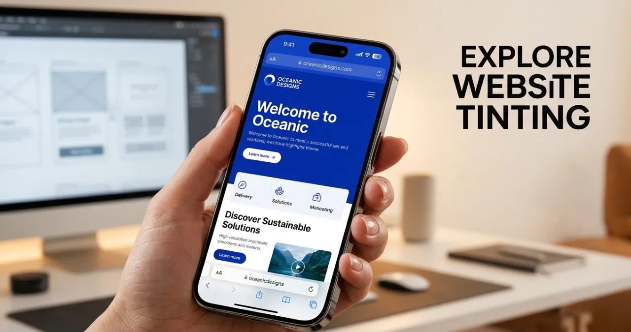
While you’re using Safari on an iPhone, iPad, or Mac, the interface automatically samples the website’s main color, and then it applies that same tone to the toolbar, taskbar, tab bar, plus the status bar. Visually, it shifts a bit toward the website.
Fundamentals of Website Tinting
Traditionally, web browsers act like a rigid frame around the web content. The content is basically in its own little box, capped by a stark gray, white, or black system menu, containing the URL bar, battery indicator, and system clock.
Website tinting removes this whole visual border. Instead of the usual separation, by extracting or assigning a specific color to the browser engine, the system hardware container blends right into the digital design software, so it all feels more unified.
Simple Guide To Dive Into Website Tinting
1. What Is Website Tinting? The Two Modern Interpretations
Website tinting is a browser and web design feature that allows the browser interface to change the appearance of other elements, such as the address bar, toolbar, or tab bar, to match a website’s theme. These changes improve the visual interface and provide a consistent browsing experience. For building a great UI, two vital concepts one should know first are:
A. Browser-Level Tinting (App-Like Illusion)
This is the most common technical description. It occurs when a web browser takes a color hint from a web page and adjusts its user interface, such as the browser’s toolbar, tab strip, and the device status area, to make it look color coordinated. Safari introduced this to the mainstream on iOS and macOS. Many Android browsers implement this to color the mobile address bar as well.
B. Canvas-Level Tinting (The Content Filter)
In a webpage layout, tinting means applying a semi-transparent colored overlay to a background image, structural cards, or sections across the layout. Designers use tinting at the canvas level to help the readability of text when combined with background photography and to help convey the specific mood they wish to achieve.
2. Types of Website Tinting
While discussing website tinting, maybe many of you have some queries regarding the types of website tinting. Well, Website tinting is categorized into different sections, which depend on the browser’s color-applied concepts, its interface, and how it defines them. Website tinting is available in different formats, such as
A. Static Website Tinting
This type of tinting process follows a single colour throughout the browsing session. The website specifies a single theme color and applies on the supported UI elements for balance. This website tinting is useful for some specific websites, such as
- Business websites
- Personal blogs
- Corporate portals
- Portfolio website (Behance)
B. Dynamic Website Tinting
Dynamic website tinting is mostly useful for changing the theme color based on the page content. It is beneficial for creating a more engaging user experience for readers, creating positive feedback, and promoting brands. This tinting feature is beneficial for
- Switching between product categories
- Setting different colors for various sections on a website
- Interactive web applications
C. Light and Dark Mode Tinting
Modern browsers support different tint colors depending on whether the user is using light mode or dark mode. This browser tinting is effective for users and improves on-screen readability. When users choose the mode of the screen, it automatically changes according to their demands.
D. Page-Specific Tinting
Each page on a website can have its own unique theme color to represent different content or sections.
Examples:
- Home page: Blue
- Blog: Green
- Shop: Orange
- Support: Purple
This helps users distinguish between different areas of the website.
E. Progressive Web App (PWA) Tinting
When PWAs are installed, they use themed colors so they look like native apps on the user’s device. Color is added to the title bar, splash screen, and browser UI. It has some core benefits while browsing,
- Native app-like experience
- Stronger branding
- Better user engagement
F. Context-Aware Tinting
Some websites adjust their tint color based on the displayed content, such as dominant image colors, video scenes, or seasonal themes. Like,
- Color-changing music streaming services based on album artworks.
- Photo galleries that fit the dominant image colour.
- Color changes with each festival.
3. Why Website Tinting Matters For Modern Ui
Website tinting is increasingly central to modern UI design because it achieves something browsers historically struggled with: visual continuity between the browser chrome and the content it displays. When a brand color extends into the system toolbar, it signals intentionality and design maturity — cues that users associate with premium digital products.
A. Maximizing Content Real Estate
While using mobile devices, the browser navigation and system status bar significantly occupy about 10%-15% of the screen. Applying the website tinting process, the browser matches its colour with the UI, and the sharpness of other structures seems to be hidden. The quick psychological payoff is that the display feels much larger, while the browser toolbar recedes visually, keeping the content primary. This creates a perceptible increase in usable display space without any change to actual screen resolution.
B. Deep-Level Brand Reinforcement
A brand identity can get kind of fragile when it’s locked in a scrolling feed. But if you stretch your brand’s core signature color past the viewport and into the device’s interface, then you’re basically stating full ownership of what people see. This consistency feels like a dedicated, costly native app, and it’s a big win for early-stage startups or SaaS teams that want to build credibility right through a web browser.
C. Streamlining Visual Hierarchy & Microinteractions
When applied directly to on- page layouts (canvas- level), subtle accent tinting helps guide the human eye without really breaking the overall structure of the site. For instance, tinting a card container on a dashboard by a mere 5% opacity shift on hover lets the user know there’s interaction, without having to use anything that feels jarring animation-wise or borders that clash.
D. Strengthens Progressive Web Apps (PWAs)
Website tinting has become one of the most beneficial ways to provide users with an app-like experience. The theme color is basically used to change the experience from a web application to a mobile application.
E. Increases User Engagement
A balanced and cool-looking interface helps people stick around longer on your website, or at least inspires them to explore further. Though tinting alone may not increase engagement, it can produce a positive user experience that can subsequently increase the retention rate.
F. Aligns with Modern Web Design Standards
Today, web users mostly expect a smooth, good-looking, and responsive digital experience on every device. Like the way you can’t really ignore it. That’s where website tinting comes into play: the ability to “splash” a site onto the browser window and reinforce its look and feel, along with anchoring it in place, feeling a little more stable, even more interesting right at your fingertips. When you combine this with popular web design elements, such as responsive designs, simple colour schemes, navigation, and transitions, it can boost the overall appearance of the website, tinting dramatically.
4. Crucial Criteria & Pitfalls: Balancing Usability And Aesthetics
Though website tinting provides an extraordinary outlook on a designer canvas, it brings some real-world challenges. If accessibility is ignored, the tinting can backfire easily.
A. The Contrast & Accessibility Conundrum
The Web Content Accessibility Guidelines (WCAG) tell you, clearly, about exact text-to-background contrast ratios (minimum 4.5:1 for normal text). But if you pick a brand tint that’s just too close to your navigation text, suddenly, your buttons plus browser controls are immediately unreadable.
Browsers attempt to automatically adapt by swapping text colors between white and black based on the tint’s luminance value. However, edge-case colors — particularly mid-range browns, olive greens, and certain muted purples — can produce results where browser controls become unreadable regardless of the automatic adjustment. Always test your specific tint color before deployment.”
B. System Theme Conflicts (Light Vs Dark Mode)
If a user sets their device to a system-wide Dark Mode to reduce eye strain, then a website that forcefully tints their browser chrome into a vibrant, high-saturation orange will cause immediate frustration. Websites really should dynamically adapt their tinting behavior based on what the user explicitly chose in their device configuration, not just push a fixed look on top of it.
C. The Fragmented Browser Ecosystem
Not every browser is going to really respect website tinting. Safari and a bunch of Chromium-based mobile browsers seem to lean into it, but other ones simply ignore the instructions, or they let users disable the effect completely through their own app settings. So your UI layout should be sturdy enough that it still looks flawless whether the browser frame gets custom-tinted or stays that usual neutral gray.
5. How To Implement Website Tinting Effectively
Website tinting helps to provide an effective visual effect to support browsers with the interface. It colors the theme of your browser and make is immersive for the users. Moreover, it gives the whole website a cleaner, modern style. So yeah, here’s how to roll out website tinting effectively.
| COMPLETE WEBSITE TINTING IMPLEMENTATION STEP 1: Basic Theme Color (All Browsers) <head> <meta name=”theme-color” content=”#1a73e8″> </head> STEP 2: Separate Light and Dark Mode Colors <head> <!– Light mode: blue brand color –> <meta name=”theme-color” content=”#1a73e8″ media=”(prefers-color-scheme: light)”> <!– Dark mode: darker variant –> <meta name=”theme-color” content=”#0d47a1″ media=”(prefers-color-scheme: dark)”> </head> STEP 3: Dynamic Tinting with JavaScript (For pages that need color to change per section) const updateThemeColor = (color) => { let meta = document.querySelector(‘meta[name=”theme-color”]’); if (!meta) { meta = document.createElement(‘meta’); meta.name = ‘theme-color’; document.head.appendChild(meta); } meta.content = color; }; // Change color when the user reaches a new section updateThemeColor(‘#e53935’); // Red for shopping section updateThemeColor(‘#1b5e20’); // Green for success state STEP 4: PWA Manifest Configuration In your manifest.json file: { “name”: “Your App Name”, “theme_color”: “#1a73e8”, “background_color”: “#ffffff”, “display”: “standalone”, “icons”: […] } STEP 5: Canvas-Level Tinting with CSS (For visual overlays within page content) .card-container { position: relative; background-image: url(‘photo.jpg’); } .card-container::after { content: ”; position: absolute; inset: 0; background-color: rgba(26, 115, 232, 0.3); /* 30% opacity brand blue overlay */ } |
A. The CSS Hierarchy Layout
Modern browsers prefer to dynamically observe the CSS layout rather than blindly trusting HTML meta headers. The browser checks your site’s styles using a strict internal hierarchy. To ensure the browser correctly samples your layout and paints its tab bars accurately, your layout must adhere to standard parameters:
- The header should be 3 pixels high
- Should maintain the width near 80%(mobile) and 90%(desktop
B. The Modern Code Implementation
Dealing with the light and dark modes of the user interface is mandatory to control the total layout. Combine the structural layout rules with the target media to handle the legacy rendering engine usefully.
6. Top 5 Benefits Of Website Tinting
Website tinting is not only a way to improve any browsing UI but also to improve branding, user experience, and overall perception of any website.
A. Seamless App-Like Experience
Website tinting is kind of a feature that breaks down that rigid visual barrier between the web browser and your content. When you sync the system status bar with your site’s header, it makes a regular mobile website feel more like a native, high-end application you’d expect from an app store, downloaded and all.
B. Elimination of Visual Clutter
Traditional browser bars create this kind of distracting chunk of gray, white, or black up at the top of the screen. With tinting, everything feels more unified; it kind of erases the needless visual fragments, so visitors can focus completely on your content and messaging, without those little interruptions.
C. Unified Visual Style for Diverse Imagery
Website tinting not only creates an exclusive visual but also helps to make it premium. If your website uses photography from several different sources or individual contributors, it can start to look kind of messy, quickly. Adding a unified brand tint, like a duotone overlay, sort of ties the whole thing together. Suddenly, mismatched photos feel more aligned, like they were gathered as part of one premium set, not random pieces. It’s an easy trick, but it makes a noticeable difference in how polished it all feels.
D. Lightweight, High-Impact Implementation
From a development perspective, while browsing it requires zero heavy JavaScript libraries and complex frameworks. Whereas website tinting is a better way to get triggered by a single line of standard HTML text for UX improvement.
E. Visual Continuity During Content Scrolling
When people scroll through a page, a compressed browser bar can make things stutter a bit, with a blocky visual transition that feels off. A color-matched tint then sort of masks those interface changes, so the top part of the device stays uniform and smooth, while elements just glide underneath.
Conclusion
Website tinting is one of the highest-ROI design decisions available to modern web teams. A single HTML meta tag or CSS configuration can transform a user’s perception of your product from ‘website’ to ‘application’ — with zero performance cost. As mobile-first browsing becomes the default standard, the visual cohesion website tinting provides shifts from a design enhancement to a competitive expectation. Implement it thoughtfully, test for accessibility, and let your brand colors extend beyond the viewport
FAQs
The theme-color meta tag is the primary HTML mechanism for implementing browser-level website tinting. When you set <meta name=’theme-color’ content=’#yourcolor’>, supported browsers use this value to tint their toolbar and status bar. Canvas-level tinting (overlaying colors within your webpage layout) is implemented through CSS. So the meta tag controls browser UI tinting; CSS controls design-layer tinting — they’re related but distinct implementations of the same visual concept.
Web browsers like Safari on iPhone and Chrome on Android offer different implementations to use web tinting.
No. Web tinting is handled by the browser and has little to no impact on website loading speed or performance. However, using clean and well-structured CSS can help browsers determine the correct tint more accurately.
Yes. On websites with multiple sections or themes, some browsers can update the tint color dynamically as users move between pages or different content areas, creating a smoother visual transition.
No, it doesn’t have any requirements on that. Most of the web tinting is depends on the HTML metadata and CSS.
Yes, it is based on the user’s preferred color scheme.
It is because some of the websites are based on the meta theme color, whereas others analyze page content, which creates differences between the colors.
Yes, as most of the tinting features are available on mobile browsers implements responsive design by providing a more seamless and native experience.
Yes, it helps by matching the browser interface with the website’s primary color to create a more consistent visual identity.
Don’t go with extremely bright, super-saturated, or really low-contrast colors, because that can reduce the visibility of browser icons and the text, for sure. Instead, pick tint colors that keep enough contrast for accessibility, so the content stays readable, even if people are using different displays or settings.