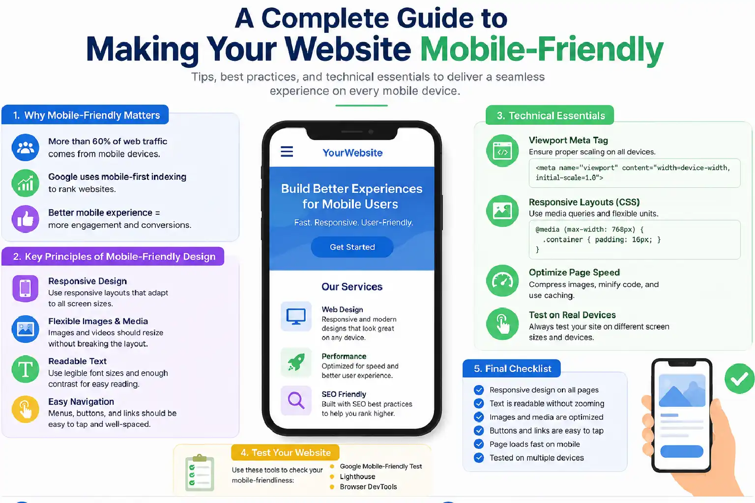
More than 60% of global web traffic now comes from mobile devices, yet millions of websites still deliver poor mobile experiences that frustrate users, damage brand trust, and suppress search rankings.
Google’s mobile-first indexing means search engines now primarily use your mobile site — not your desktop version to determine rankings. A website that isn’t optimised for mobile is effectively invisible to a growing majority of your audience.
This guide covers exactly how to make your website mobile-friendly: from responsive design fundamentals to speed optimisation, touch-friendly UI, typography, navigation, and form design. Follow these steps, and you’ll build a site that satisfies both users and search algorithms.
What Does A Mobile-Friendly Website Refer To?
A mobile-friendly website refers to those websites that are designed to display and function correctly on smartphones or tablets. The users should benefit when they open the site, whether on a smaller or bigger screen, the content should automatically fit in the display, and there is no need to zoom in to read it deeply. Many of these kind of websites requires responsive design, techniques, and dynamic serving for mobile optimisation.
Benefits Of Mobile-Friendly Websites
A positive website interpretation and experience make a website acceptable to the users. A well mobile-optimised or mobile-friendly website helps users with multiple advantages, like
- Improve search visibility: With the advancement in mobile technologies, the number of mobile devices and their users is growing rapidly. In a fast-paced society, people hardly have time to sit at their desktops and browse through a website. People are more likely to browse on the internet while they are in motion, so it makes clear sense that mobile experience matters a lot. So, with its bigger user base, mobile platforms can offer more visibility and raise the chances that the website gets turned into actual business conversion traffic that matters.
- Polish user experience: some analization shown that around 60% of mobile users leave a page instantly when they do not find the web page to be compatible with their mobile devices. It’s also pretty obvious to anyone, because websites that are not optimized for mobiles tend to render in a rather clumsy way, with a UI that feels off and loads extremely slowly on mobile devices. Honestly, it seems unrealistic to expect these people to appreciate the brand in such a scenario.
So, optimizing the website for mobile devices gives a smoother, almost frictionless browsing experience for the users, and they’re much more likely to make purchases if they truly like the product.
- Increase lead generation: Most businesses in the market today really understand the importance of having a mobile-friendly website. Still, making websites that are not responsive for mobiles can be harmful to business in general. Optimising a website for mobile devices is needed to stay competitive in the market.
- Streamlined Maintenance: Using a single, responsive website for both desktop and mobile is much easier to manage, update, and troubleshoot than maintaining separate websites for each device
Top 6 Suggestions To Build A Mobile-Friendly Website
1. Embrace Responsive Web Design
A responsive web design is a blueprint of a mobile-friendly site. Despite building separate websites for mobile and desktop or laptop, a responsive site uses a single URL and the same HTML code for both websites. Relying on the same CSS can be a great opportunity to make your website mobile-friendly.
Key elements of Responsive design
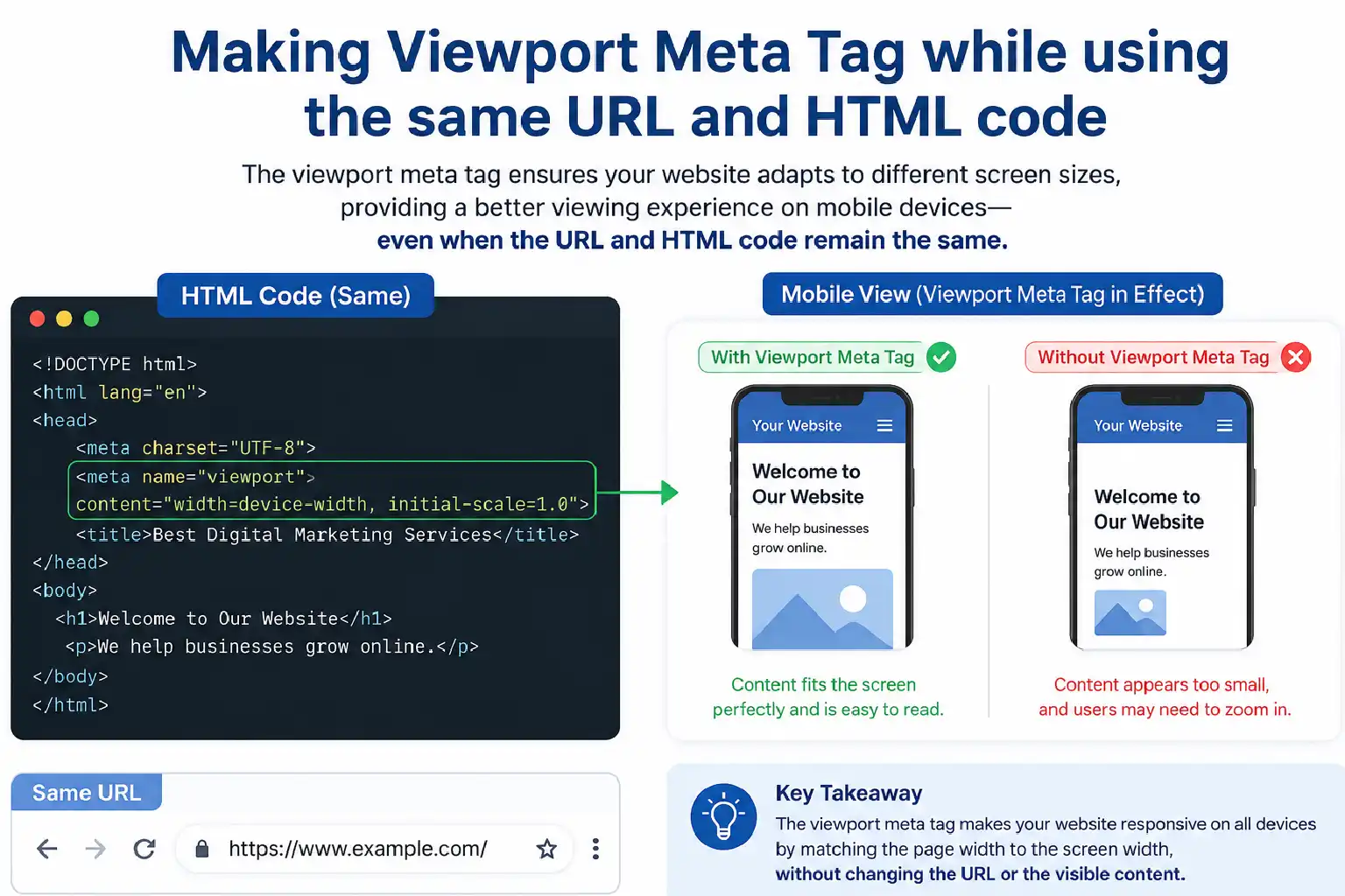
- The meta tag: The meta tag is a pivotal portion which enngages the viewers towards the website and its posts. So you need to include that in the head of your HTML document.
- Fluid Grids: Instead of using fixed pixels, using relative units such as percentages or modern CSS layouts ensures an increase in scale naturally.
- CSS media: Modern CSS layouts allow for applying the same and specific styles based on the device to make the website usable in both mobile and desktop environments.
2. Prioritise Speed And Mobile
The modern era is always searching for those websites that are preferable and provide the fastest service. Meaning, it does not take a long time to upload or load applications. So the performance is the core ranking factor for increasing web vitals.
Control Over Mobile Load Times
- Optimise Images: While scrolling through a website, the images on the website play a vital role. The old format of images, like JPEG or PNG, in modern times can not grab the attention of the audience. Whereas the modern formats, such as WebP or AVIF, offer superior compression to old formats.
- Minify And Bundle Code: Dragging out the unnecessary characters, comments, and spacing from your HTML can help your website bind the code well. Using tools such as webpack and vite can minimise the plugging and shrink files.
- Leverage Browser Caching: When you are making your website, try to use browser caching, and order it so the static files like logos, fonts, and style sheets get stored so they don’t have to be redownloaded each time, this way the experience feels faster. Also, keep in mind that setting it up well can reduce repeated loading, even when users come back.
3. Design For Touch, Not Click
There is a huge difference between the user interface of a mobile and a desktop. Desktop users are used to working with a mouse cursor, while smartphones rely on thumb input. This fundamental difference needs a massive shift to design the correct interface that makes a website mobile-friendly.
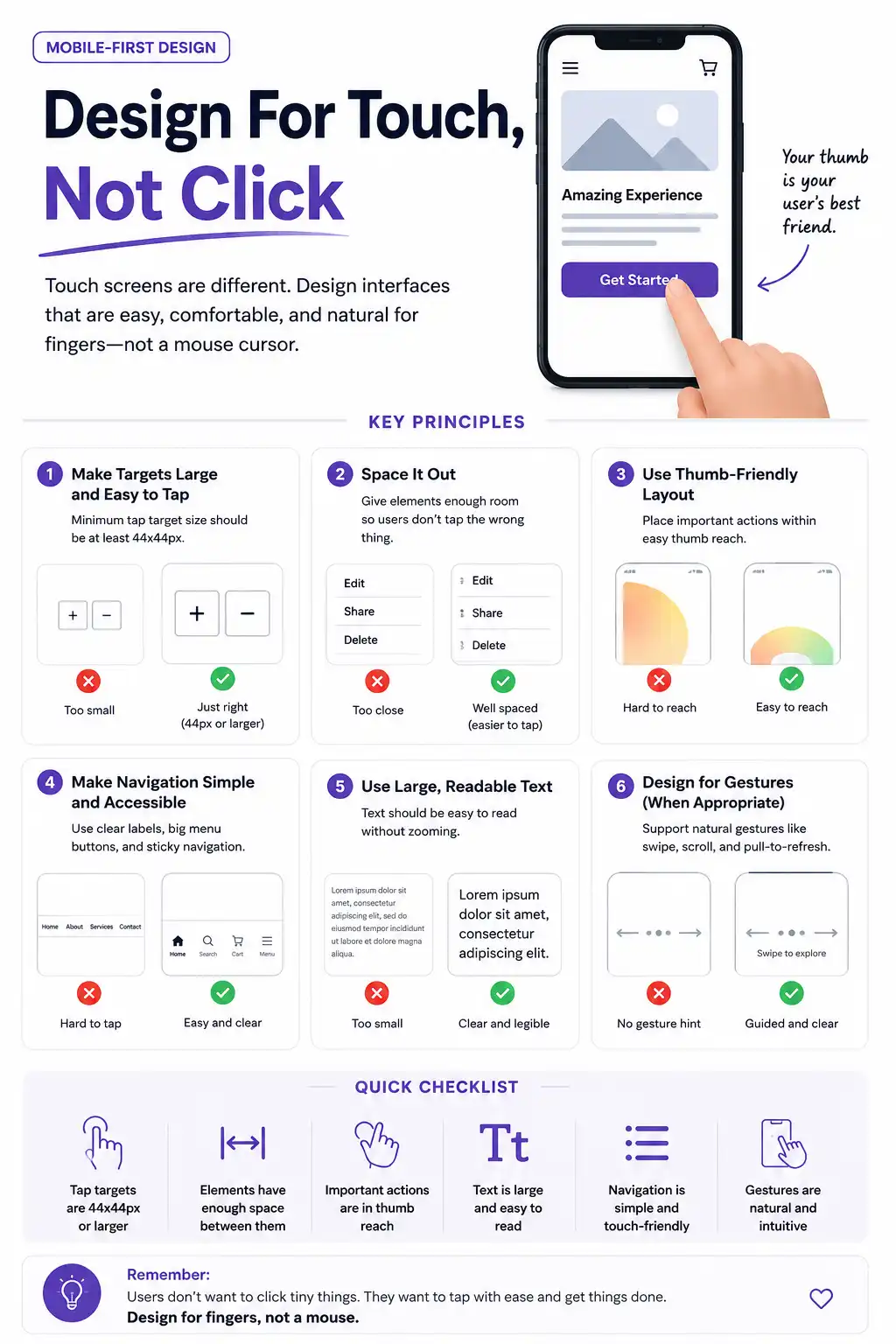
Best Practice For Making UI
- Enlarge interactive Elements: A user-friendly interface is important to use the application or work on websites. Keep clarity for buttons, links, and fields so that they can be easily tapped.
- Ditch the Hover effect: Make sure there is no hover section on your website. The hoovers are inactive application for using in mobile. So your website should be usable with a one-tap process.
4. Optimise Typography And Readability
Looking at text on a tiny, black display can really cause eye fatigue, especially when someone is outside and the sun is hitting directly. Like, it’s harder to absorb the words, and then the content needs to remain legible, not basically force the user to pinch-zoom just to get what’s being said.
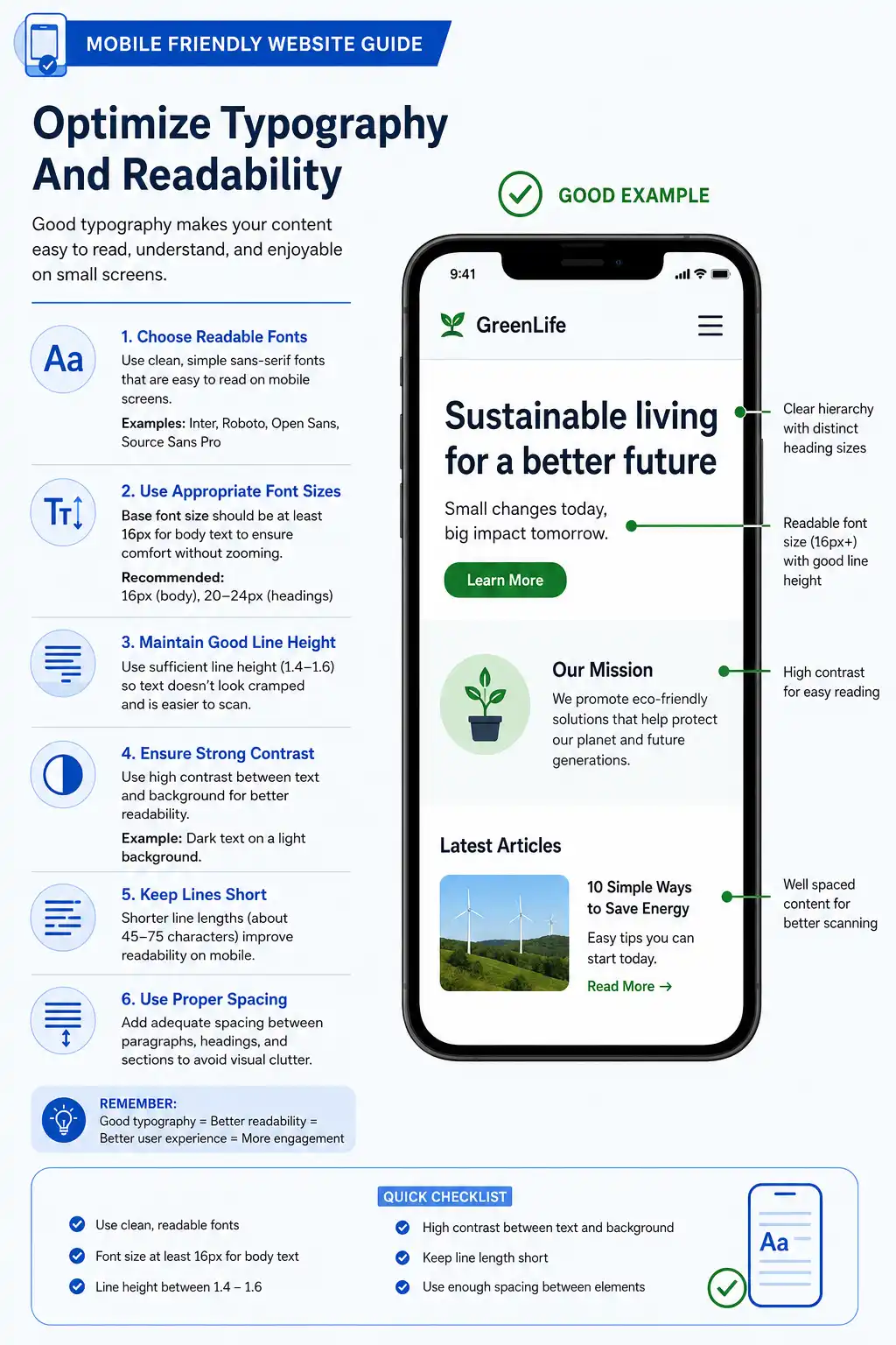
- Font Size: The readability of your website depends on the font choice. Keep the fonts within 16px for the body. If the font is smaller than it needs to be, zoom in to see.
- Line height: While putting any text in a website, always keep that empty gap between each paragraph to prevent text from blending, like 1.5 to 1.6 should be the target.
- Contrast: Try to set a contrast ratio of 4.5:1 between the text and the background so it meets the accessibility standard, no debate
- Font selection: always pick a font that is readable, understandable, and easy to process for the readers. Fonts such as Roboto or system fonts are good for the body text. Use the other fonts, such as Calibri, Arial, or Times New Roman, for the headings or big subheadings.
5. Streamline Layout And Navigation
A huge desktop mega-menu with dozens and dozens of links turns into this total unusable headache on a 6-inch phone screen. Mobile navigation has to be highly focused because prioritisation is everything. Otherwise, it becomes unusable quickly.
- Keep the sticky header: Think about pinning that simplified navigation bar, or maybe a “Back to Top” button, right on the screen so people never have to scroll all the way up just to locate the menu again. It is a small change, but it feels more immediate, and honestly, it saves time, especially on those super-long pages where it’s easy to lose your place.
- Professional menu bar: Intrusive pop-ups that stop the main content dead in its tracks are really disruptive on mobile devices. Google actually penalizes sites that rely on intrusive interstitial pages on mobile, because shutting them off with a tiny “X” can be awkwardly hard for thumbs.
6. Simplify Forms And Data Entry
Filling out the forms, like the checkout page, a newsletter sign-up, or even a basic contact form, can be notoriously tedious on a mobile keyboard. This extra friction can make people bounce before they finish, so that there is no drop off.
- Reduce fields: Informations which are importenmt to give on the website should only be included.
- Enable auto fill: Your website should have an autofill option so that browsers can autofill the information instantly.
Checklist for Mobile Optimization
| Area | Best Practice | Goal |
| Layout | Use responsive Web design | Seamless scaling across the screen size |
| Sizing | Set view report tag | Unwanted click prevention |
| Speed | Compress images | 3-second loading time |
| Typography | Minimum size 16px | High readability without zooming |
| Forms | Minimize fields | Lower the abandonment rates |
5 Mistakes To Avoid While Preparing A Mobile-Friendly Website
When you shift to a mobile-first mindset, it is easy to accidentally fall into roadblocks that annoy people or quietly hurt your search rankings. Even experienced developers sometimes fall into those common traps when they try to squeeze a desktop experience into a pocket-sized screen, and then everything feels a bit off, at least for a while.
1. Tiny Tap Targets
One of the confusing mobile experiences is mistakenly tapping on a link or button due to their conjusted placement.
- Close position: Placing the inline links and icons closely in a single line
- The Solution: Make sure a minimum size of 48*48 pixels with a margin space maintained for links and icons. If you have a list of links, give them vertical padding so a thumb can cleanly press one without overlapping another.
2. Leaving Large Images Unoptimized
The size of a file doesn’t really depend on the changes in images. It may create difficulties for such situations, like
- Wronge using of CSS: If the CSS is used incorrectly to scale down a 5NB desktop banner, then probably the image can not open on a mobile. This can create a systemic problem in mobiles.
- The solution: To prevent this page, use more image formats such as WebP or AVIF to utilise the proper HTML to preview the pictures on mobile through a website.
3. Accidental Horizontal Scrolling
In a mobile-friendly website, users are comfortable scrolling vertically. However, the horizontally scrolling method is a breakdown of mobile browsing energy.
- Fixed pixel method: Using fixed pixel widths on layout containers or images, which pushes content past the edge of a 375px-wide smartphone screen.
- The solution: Using relative units and continue cheking can ensure breaking the bounds of the viewpoint.
4. Unfit Typography
Zooming in and out while browsing a website is not the right way of browsing a website. A common factor which breaking down the rules of web browsing through a mobile, that is,
- Using the wrong text size: Using the wrong text size for a mobile website or failing to adjust the heights of lines, making the paragraph congested and unreadable. Thus, users need to be forced to zoom in.
- The solution: Adjust the body of the text within 16px and ensure the height of the text at least 1.5 so that there is enough space.
5. Hiding Vital Content to save place
In the early days of mobile design, it was common practice to hide heavy desktop features from mobile users to keep the page clean. Today, this hurts your business and your rankings.
- Stripping the text: Stripping out text, paragraphs, and customer reviews to adjust the mobile page, adding a high cause of unsupported mobile websites.
- The solution: Rather than deleting the content, reorganise the whole thing. Use tabs or swipable carousels to hide visual clutter.
Tools To Make Your Website Mobile-Friendly
To wrap your head around mobile-friendly website tools, think of them as a crew of specialists working on your site in the background. Like you wouldn’t take a hammer to paint a wall, and you can’t just use one single tool and expect everything to run perfectly on smartphones.
The builders
- Figma: Mock up your website for viewing in mobile phone smart view to check the column stack and button size to avoid wasting time. Use this tool before starting to arrange the codes.
- Chrome DevTools: Used while coding. You can right-click any page in Chrome, tap Inspect, then click that device icon, and yeah, it changes everything fast. It basically makes your browser into a mobile simulator, so you can see how the elements adjust, resize, or reflow on different phones.
The Speed Inspector
- Google Light House: This is the baseline standard for mobile health. It kind of simulates loading your site on a mid-tier mobile phone, using a weak 4G connection, like pretty much. It grades your site from 0–100 and says, pretty clearly, which pictures are too big, and so on.
The real world Chekers
- Mobile Viewer: It helps to display the live website across different devices on one screen. This tool helps to copy your instructions while scrolling through the website.
- BrowserStack: That’s where they host actual physical smartphones in the cloud, like for you to prod them. Testing on a real phone cloud catches those strange device-specific glitches that basic browser simulators don’t always catch.
Conclusion
If you shift your perspective into a mobile-first mindset and start auditing your site against these principles, then you will end up with something that feels quick, accessible, and frictionless at the same time. It should please both the real humans who visit and the search engine algorithms as well, even though they do it themselves.
FAQs
Making a website responsive means ensuring it automatically adapts its layout, text, and images to look and function perfectly across all devices
Using fixed widths (like width: 600px) on containers. When a phone screen is only 390 px wide, a 600px container will force the user to scroll horizontally to read your site.
You can, but you shouldn’t. Standard desktop images are far too heavy for mobile data plans. You should use Modern Image Formats like WebP or AVIF, which compress images up to $30\%$ to $50\%$ more than JPEGs without losing quality
Generally, no. This is called “content discrimination.” Mobile users expect the exact same functionality as desktop users. Instead of hiding features, prioritise and restructure them. Use collapsible accordions, swipeable horizontal cards,
Mobile and desktop websites differ primarily in their layout, navigation, and user interaction. While desktop sites feature multi-column displays and use precise mouse-and-keyboard controls, mobile sites are streamlined into single-column, touch-friendly formats that prioritize immediate access to core content.