It has been a few months since the iPhone X and iPhone 8 were released. Consumers and experts alike have explored all aspects of the device, which helps portray a clear picture; Apple has a radical future in mind. The iPhone X envisions a prospect where smartphones are further integrated into our daily affairs, and become a critical component of our daily lifestyles. You can see this in the dramatic ways it has evolved its immediate predecessor, as well as the iPhone 8 itself.
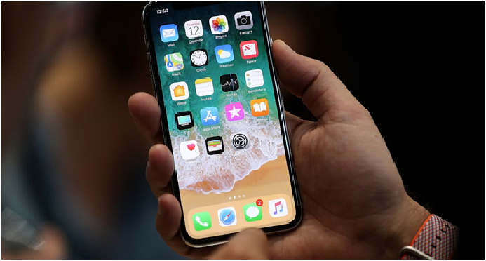
The most apparent of these is the elimination of the home button, which is symbolic of the fact that times are changing. The iconic rectangular, curvy around the edges shape with a single home button has become synonymous with the ‘iPhone’ label, and has been a staple since the very first of these devices was launched in 2007. Yet, despite its iconic status, this design aesthetic was increasingly becoming outdated. Its complete elimination in favour of a nearly all-screen façade and all-glass back is a clear demonstration of the fact that Apple is done with its past, and is looking towards new opportunities. This is further highlighted by the fact that there is not even a digital home button. Instead of copying their Android competitors, Apple chose to innovate new gesture controls for essential navigation.
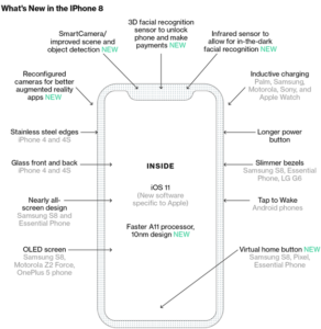
What the X loses in the famous home button, it makes up for with a cut-out at the top of the screen, where the cameras and sensors are situated,which adds a distinct flavour to the overall design of the device. In place of a traditional home button, whether digital or analogue, Apple has instead opted for a software bar. Users can unlock and open their phones by dragging it to the middle of the screen. When using an app, the same gesture will enable multitasking and another upwards flick will result in them returning to the home screen. The multitasking interface has also been completely redesigned from a stack of cards to a series of standalone cards; a measure that makes it easier to understand the contents of the screen.
Apple has not thrown all of its engineering philosophy out of the window. For example the newer, high-end iPhone also has follows the iPhone development tradition of making new phones increasingly taller and slimmer. However, the X has an impressive OLED screen that dramatically enhances users’ experience. While its overall dimensions are similar to that of the iPhone 7, the elimination of the home button, and the concentration of essential hardware – including facial recognition sensors – in the above mentioned ‘notch’, means that the overall screen is actually considerably larger. This is because it has been rounded at the edges – previous models were merely rectangular – and now meets the edges of the façade.
The larger screen means that more content can be showed simultaneously on the screen, something which its iOS development team took into account. The new menu shows six vertical rows of apps, or a total of 24 apps per page, including the grey dock at the bottom, which displays the most commonly, used applications. This dock has been redesigned to be similar to the iPad’s iOS 11. Moreover, the coloured OLED screen means that the display almost seamlessly blends with the phone’s thin and black edges; giving the exterior a smooth and elegant look.
Apple has also retained a flat screen, instead of the fully curved screens offered by Samsung on their competing phones. It has placed a steel band around the phones that the screen gently curves into. They have also installed tiny antennae cuts into this band in order to enhance cell phone reception. The last time Apple used steel sides and glass casing was on the iPhone 4 and 4s, after which they began using metal backs and sides with all future models until this one. But it has come back this time as new, improved, and water-proof.
Moreover, due to the larger size, the power button’s length has been increased in an effort to make it easier to press when one is holding it in one hand.
Since the status bar, which displays essential phone information like Wi-Fi connectivity and cellular reception, cannot be placed at the top – where it has been traditionally located in all smartphones – due to the ‘notch’s interference, the iOS builder had to get creative. They programmed this information to be visible in the ‘ears’, which are the regions at the top of the screen on either side of the ‘notch’. As a consequence of the limited space, the contents of this makeshift status bar changes and displays relevant information according to the situation at hand so that it does not lose any of its key functionality.
While these are all just the physical alterations to the famous iPhone design, there are also a number of internal software improvements. Taking a cue from Android phones, Apple has introduced a tap-to-wake function. Instead of having to press a button, just tap the screen and the screen will display vital information like the battery, the time, the weather, and the lock screen. You can also give your notifications a quick glance without having to unlock your phone. This decision is also influenced by the elimination of the analogue home button from the screen.
One of the most innovative functionality features to be introduced in the iPhone X is the facial recognition feature. While not completely new, Apple has greatly expanded on its potential. Much of the phone’s operations centre on its ability to identify you. For example, the phone can tell when you, the owner, are directly looking at it. When you are, it automatically pulls down and displays notification previews. This is just one of the many small, yet remarkable ways Apple has integrated this feature into the phone.
The new iPhone X completely alters how users interact with not just Apple products, but the smartphone. It has set a new bar for others in this trade to meet and has rebuked critics who were claiming Apple is a dying company that is losing its creative prowess. Indeed, the X is an impressive leap forward in smartphone technology.


